
Watercolor Demonstration by Pradeepa Thirumulu - April 5
|
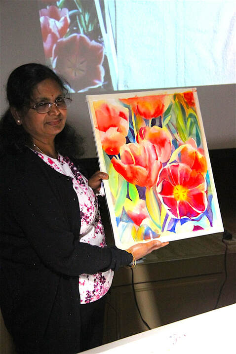
Pradeepa Thirumulu gave a terrific demonstration of her wet into wet and negative shape painting style. The materials she usually uses are Arches rough or cold press paper, DaVinci, Daniel Smith and Lukas watercolors, big brushes—flats and quills (Danube)—and two water cups—one for washing out the brush, the other therefore stays clean to use to mix new paint, or for lifting an area. For her pencil drawing, she usually uses a 2B pencil.
Working from a couple of photographs of tulips, Pradeepa drew a pleasing composition. She first created the larger flower shapes and then with just a few lines indicated leaves or stems. She likes working wet into wet, not knowing exactly how it will be. She first used a big brush to wet the paper. Then she got some pigment and started with a light color, being sure to leave whites. She built up her colors by dropping in some yellow (aureolin or azo) over leaves and a little into the flower. Then she moved to azo orange for the darker parts, blending in (wet/wet) to create soft edges. She might tilt the painting to move the paint around if one area had too strong a color. She next moved to pyrol red, again “charging” in the color, letting it flow into the areas where she wanted it. She started to put in some turquoise in a few spots, beginning to develop the background stems and leaves. She moved back and forth adjusting the darker areas of the flowers, using red, or magenta to darken sections or create a shadow in a petal; as well as darkening areas between the flowers and stems to pop out their shape. She used manganese blue and yellow to make green, changing to turquoise or thalo with the yellow to create a different green. For the most part she kept to transparent paints when layering colors, then as she needed more details, she used more opaque colors. |
At the break she dried the painting, and added a few more pencil lines so as not to lose the compositional shapes. After the break she refined edges and shapes with darks (often manganese blue). She made leaves with just a couple of strokes to suggest the shapes, often softening the color on one section of a leaf to give it shape or depth. She created more details and shadows near the focal point flower to bring it out, again moving back and forth between the background negative shapes and darks, and the flowers. She maintained light edges of the flower against the darker sections of the background to keep the focus and create an overall pleasing painting. With a few more darks in the center of the blooms, or in the negative space behind, the painting was finished. As you see from the photos, it turned out beautifully!