
Pete Morris demonstration - September 1, 2017
by Angela Alvarenga
|
Rather than using watercolors, Pete Morris gave a beautiful demonstration on his use of Sumi-E ink with a splash of watercolor to enhance a focal area. Although he was painting mainly in shades of gray, he used a color reference photo because he can already see the values. As he remarked during his demo, pay attention to the values! He likes Sumi-E ink because it gives softness to the shadows, it allows painting in layers without becoming overworked because it doesn’t show brush strokes, and he can punch up the darks at the end with the blackest tone.
He started with a 30% gray scale light wash for the sky and foliage area. The ink dries lighter than it looks when first put down, so Pete gradually built up the darks and the shadows through following layers, always thinking about the edges of the objects and looking for interesting shapes. He put in the red watercolor in the signage on the building pretty early on. He noted that when one puts in lettering, as long as the |
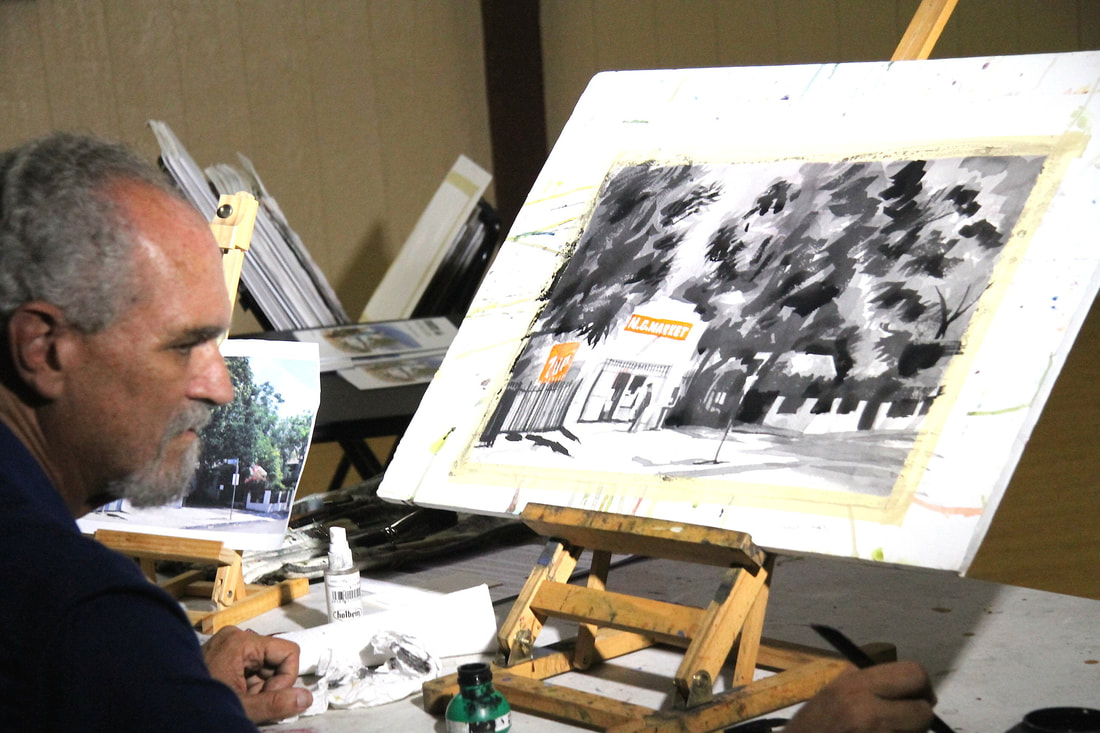
|
appearance of the letters are consistent, even though not perfect, the eye will figure out the words, and they will look right.
Leaving some empty spaces in the tree shapes, in successive layers, he concentrated on the edges to define the shape of the tree. He sometimes uses distressed brushes to give the sharp leave shapes or create randomness to the edge. He uses the foliage in the back to help construct the foliage in the front, as he paints from back to front and builds up the grays gradually.
Once again at the end of the demo he encouraged us to pay attention to the values, and said if you can nail the shadows you can nail the picture. The result of his demo was a wonderful rendering of a store in “Toonerville.” Thanks Pete for sharing your expertise in this inspiring demo!